A well-adapted UK
Animation / Campaign
The Learning Curve
How do the world's education systems compare? Pearson had the data to answer that question. Our challenge was to make it accessible and explorable to a global audience.
The Learning Curve is a research initiative that benchmarks national education systems worldwide - a substantial and complex dataset that has generated significant public and media interest. Turning a large volume of raw data into something accessible, engaging, and press-worthy required both analytical rigour and carefully considered design.
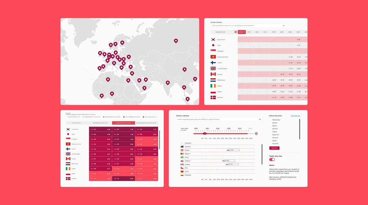
An immersive, dynamic data experience
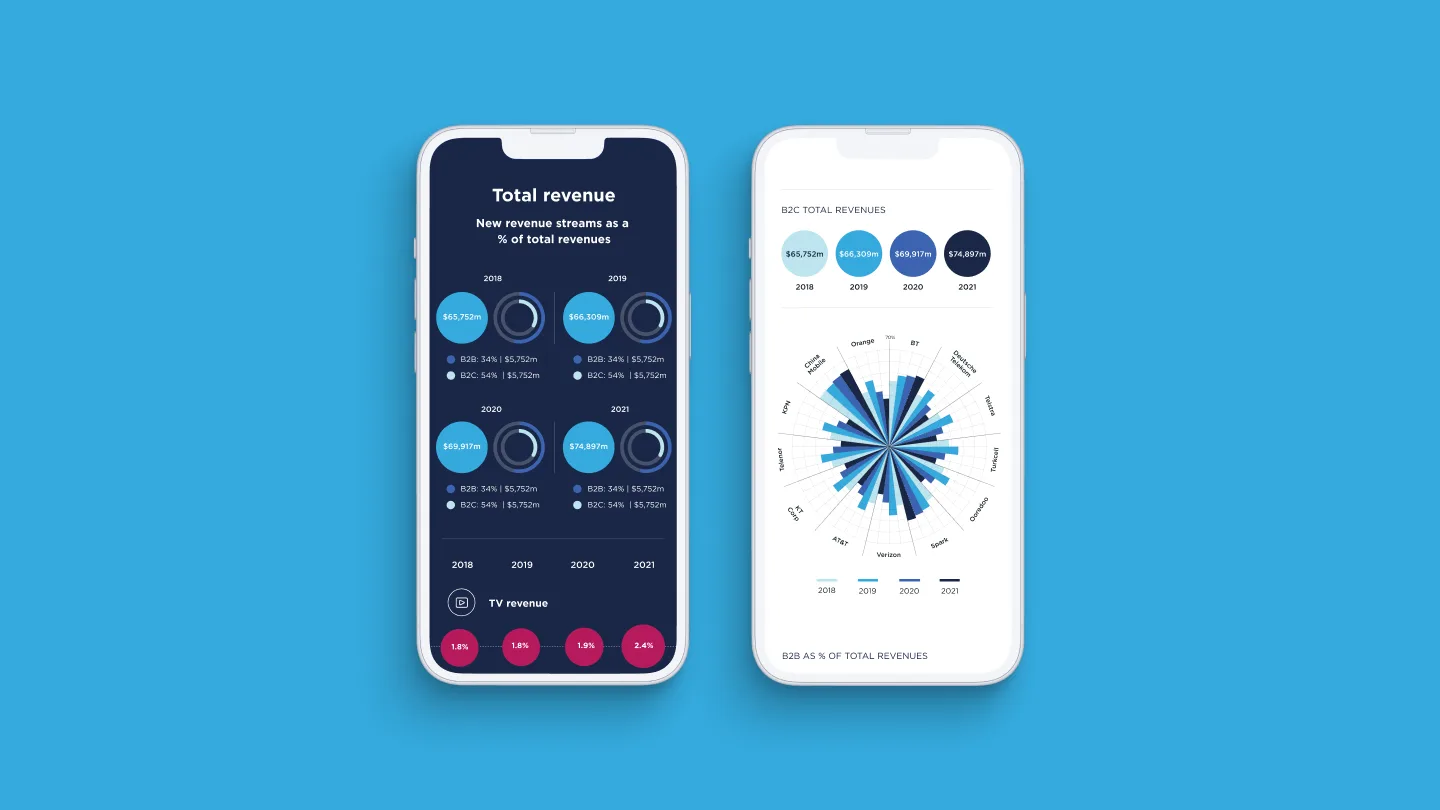
Soak worked with the Pearson team to create detailed user flows and a series of interactive prototypes, testing and refining how each dataset could be visualised.
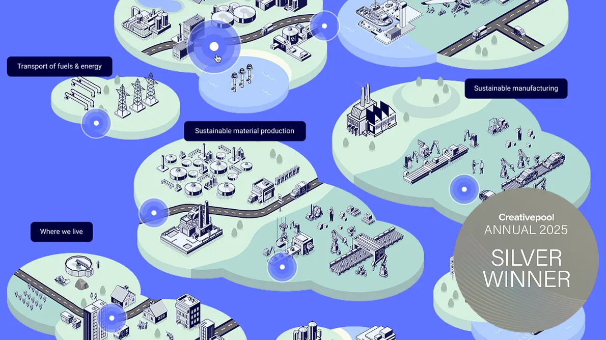
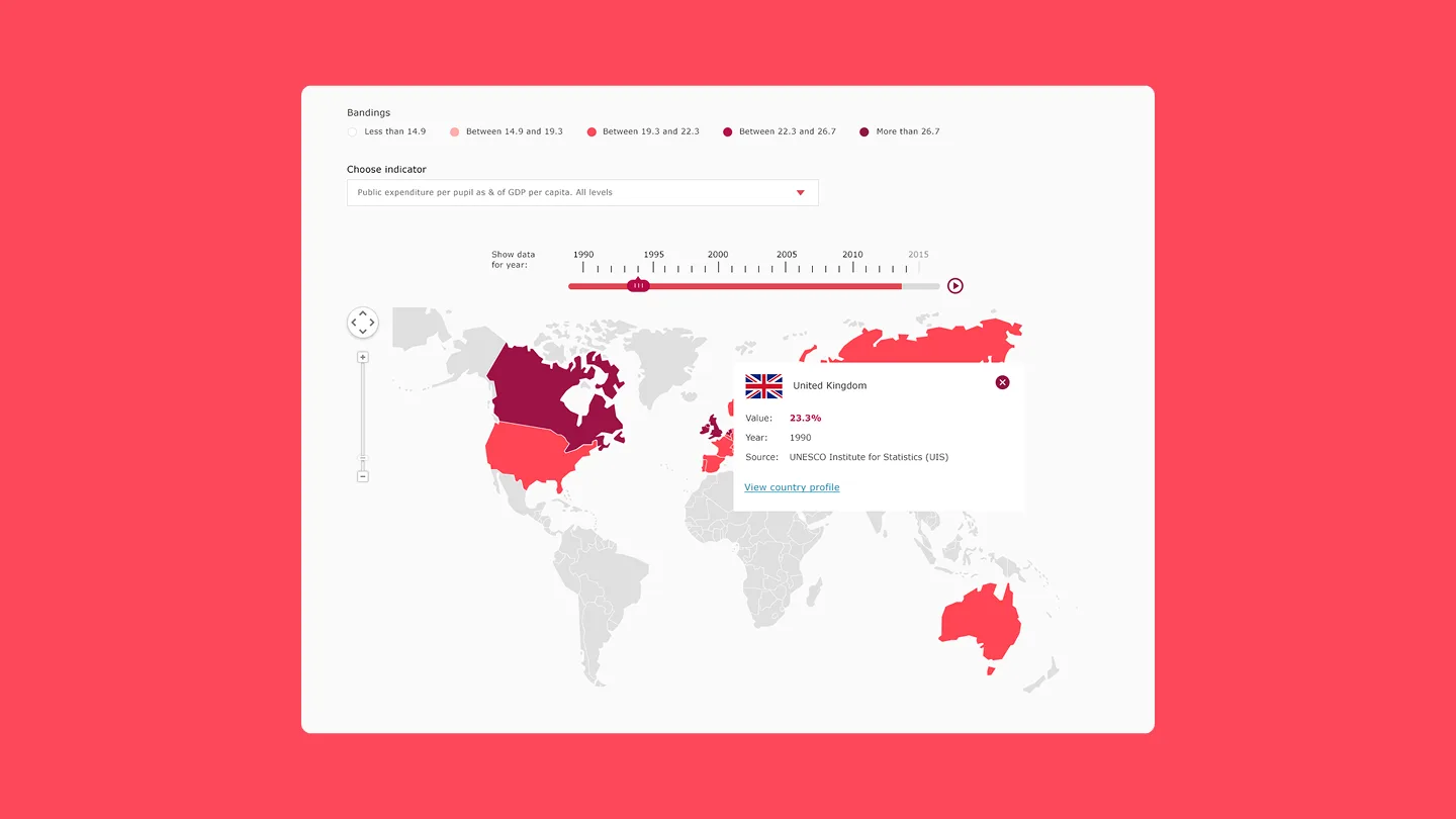
The immersive data tool brings data to life through stylised illustration and dynamic filtering across all key data points — giving users meaningful control over how they explore the global league tables and country profiles at the heart of the experience.
A successful result
The Learning Curve captured the world's press's attention immediately upon launch, with significant coverage driving worldwide exposure and over 250,000 unique visitors in the first month.