data visualisation
infographics | interactive reporting | dashboards
Data storytelling with precision. For 15 years, we’ve specialised in translating complex information into clear, engaging visuals, from static infographics to real-time interactive dashboards.
faqs
That’s usually where we start! We’re used to taking raw, complex information and finding the ‘story’ inside it. We’ll work with you to clean up the message and turn those numbers into something clear and easy to understand.
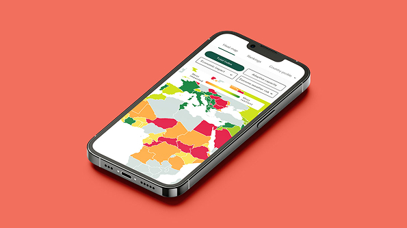
Both. If you need a high-impact graphic for a report, we can do that. If you need a live, interactive dashboard that pulls in data in real-time so you can track your business, we can build that too.
Absolutely.We create high-resolution formats that look great on everything from a massive boardroom screen to a social media feed or a printed annual report.